
What Makes a Restaurant Website Easy to Use
What makes a restaurant website easy to use is a clear layout, fast loading speed, simple navigation, and a design that works well on mobile. When visitors can find your menu, location, and booking options without any effort, they stay longer and are more likely to become customers.
But most restaurant owners don’t think about their website this way. You’ve probably spent hours perfecting the food, the service, and the dining experience. Meanwhile, your restaurant website design gets pushed to the bottom of the list. And if the site is confusing or slow on a mobile phone, people leave without saying a word.
We’ve helped hospitality brands like Philadelphia Bar and Restaurant fix exactly this. This guide covers what actually makes a restaurant website work, from first impressions and branding to UX design, interface elements, and mobile usability.
Why Restaurant Website Design Affects First Impressions
Your restaurant website design is the first thing potential customers interact with before they ever walk through your door. Most visitors make a judgment about your site within a few seconds, and that judgment is based almost entirely on how it looks and how fast it loads.
There’s no way around this. If your web pages take too long to appear, or the layout feels outdated, people leave before they even see your menu. Google actually tracks this through something called Core Web Vitals, which measures loading speed, visual stability, and how quickly your site responds to user interaction.
So when your restaurant website design falls short on any of these, you’re losing visitors before they get a chance to know your business.
That’s why a clean site with sharp images, readable fonts, and a clear page structure builds trust right away (and yes, we’ve seen that play out more than once). When your website feels professional, visitors are far more likely to explore your menu, check your hours, or make a booking.
How Hospitality Branding Shapes the Way Visitors Experience Your Site
Your brand identity is what helps visitors connect your website to the real dining experience, and when it feels off, people notice. Here’s how three key branding elements shape the way users experience your site.
Colours and Fonts
Your colour palette and font choices should reflect the personality of your restaurant. For example, a fine dining venue might use dark tones and serif fonts to communicate elegance, while a casual burger bar might go with bold colours and a chunky, playful typeface.
We’ve worked on enough hospitality sites to know that even small font changes can shift how visitors feel about your brand.
Photography
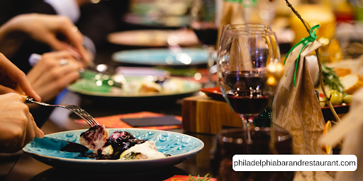
Stock photos rarely get the job done. Real images of your food, your space, and your team give users a genuine sense of what to expect when they walk in.
A good example is when a restaurant showcases its actual plating and kitchen setup on the homepage, because that kind of authenticity builds trust faster than any generic food image ever could.
Consistency Across Platforms
Your brand identity should look and feel the same across your website, social media, and any other platform where customers find you. If your Instagram page uses warm, earthy tones but your website feels cold and corporate, that mismatch sends a confusing message.
When the hospitality industry gets this right, visitors build familiarity and recognition over time. But when branding feels disconnected from the real experience, people lose confidence in the business.
Now, let’s look at where things go wrong.
What the Hospitality Industry Gets Wrong About Website Usability
The hospitality industry tends to focus heavily on how a site looks, but usability is what keeps users on the page. In fact, most of these are easy fixes.
So let’s look at the most common mistakes we see across the hospitality sector:
- Buried Information: Many restaurant websites hide basic details like hours, location, and booking options deep inside the site, making it harder for users to access what they need (that’s a mistake most visitors won’t forgive).
- Overloaded Navigation: When your information architecture is cluttered with too many menu items, visitors struggle to find even the simplest features. Research from Nielsen Norman Group found that hiding navigation behind a hamburger menu cut discoverability almost in half on desktop.
- Disruptive Page Elements: Auto-playing music and large pop-ups interrupt the user interaction and push people to leave quickly. These usability issues tell visitors that the website was designed for the business, not for them.
If any of these sound familiar, we’re here to tell you that this is very common. Thankfully, though, each one can be fixed without rebuilding your entire site.
Once that’s established, our next focus is on interface design.
Interface Design Elements That Keep Customers on Your Page
The right interface design elements make it easy for visitors to do what they came to do, like book a table or browse your menu. And when you’re designing websites for restaurants, every element on the page should guide the user toward an action.

One thing we keep running into when auditing restaurant websites is that small layout choices have a big impact on usability and overall effectiveness.
To show you what we mean, here’s a quick comparison of what works and what doesn’t.
| Good UI Choices | Bad UI Choices |
| Visible “Book Now” button on every page | Booking link buried in a submenu |
| Sticky navigation bar that follows the user | Navigation that disappears after scrolling |
| Clear spacing between sections and elements | Cramped text and overlapping images |
| Menu accessible within one click from the homepage | Menu hidden behind multiple pages |
These might seem like small details, but each element affects how customers interact with your site.
When the layout is clean and the features are easy to find, users stay longer and take action. So if your design process hasn’t accounted for these basics, even a great-looking website can lose its effectiveness.
UX Design Basics Every Restaurant Owner Should Know
If your website looks great but nobody can find the menu, you’ve got a ux design problem. The term user experience refers to how easy and enjoyable it is for someone to use your site, and good ux design defines user experience as something that puts the visitor’s needs first.
But here’s the thing. You don’t need to be a designer to evaluate whether your site works well. Just ask a few people to find your menu, book a table, or locate your hours. This kind of basic user research is one of the most effective tools for spotting usability issues. Because if users struggle with tasks that should take seconds, that tells you something about user satisfaction and the overall user experience on your site.
When you’re designing websites with ux design in mind, two features worth paying attention to are visual hierarchy and accessibility.
Visual hierarchy means organising content so the most important elements, like your menu and contact details, stand out first. And accessibility features like alt text on images and proper heading structures fall under the Web Content Accessibility Guidelines (WCAG), which is the international standard for making web content accessible to all users.
Ultimately, even small changes based on user feedback can improve the overall user experience and help your restaurant website design serve customers better.
How to Improve the Overall User Experience on a Mobile-Friendly Website
Believe it or not, mobile devices now account for over 60% of all global website traffic, according to Statista and StatCounter data from 2024. For the hospitality industry, that number is even higher. So if you haven’t tested your restaurant website on a mobile phone recently, now is the time to evaluate how it performs.
Let’s check out the areas worth focusing on to improve the overall user experience.
- Thumb-friendly Buttons: Your buttons and links need to be large enough for users to tap without zooming in, because on a mobile-friendly website, usability depends on how easy the interaction feels under someone’s thumb.
- Simplified Menus: Mobile users don’t have the patience for deep navigation. Keep your menu short, put the most important pages up front, and make sure customers can access your menu and booking features within one or two taps.
- Cross-device Testing: Testing your site across multiple devices and screen sizes helps you catch layout and usability issues before your customers do (a five-minute check that can save you a lot of lost customers).
Even small ux design improvements on mobile can lead to more bookings, longer site visits, and a better overall user experience for every visitor.
A Great Homepage Layout Is Just the Starting Point
A strong homepage layout gets you started, but every page on your site needs the same level of attention.
Your restaurant website design, brand identity, and ux design choices all shape the term user experience your visitors walk away with. And the small elements, like button placement, font choices, and mobile usability, are often what bring the biggest change.
Keep testing, keep asking for user feedback, and keep refining your site based on how real customers use it. That’s how you build a restaurant website that works.